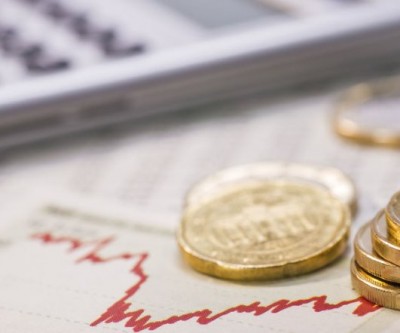
A time for caution, though gold stocks look like good buys While fund manager Adrian Day believes investors should tread cautiously in the market right now, he is upbeat on some gold stocks. The Gold Report | January 12, 2017 | 1:33 pm
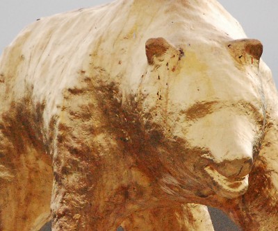
This simple chart shows gold price remains firmly in bear grip Gold bulls tried and failed on numerous occasions to break downtrend in place since 2011. Frik Els | January 12, 2017 | 12:43 pm
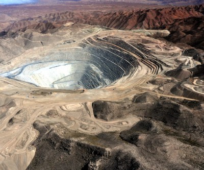
DRC says Ok for Glencore to take full control of Mutanda copper mine Mines Minister Martin Kabwelulu said he “didn’t believe” the government needed to authorize changes in ownership in that or any project. Cecilia Jamasmie | January 12, 2017 | 10:02 am
These two Canadian gold companies challenge you to disrupt mining Innovators now have have until Jan. 25 to pitch their ideas. The winner will walk away with up to $1 million. Cecilia Jamasmie | January 12, 2017 | 9:26 am
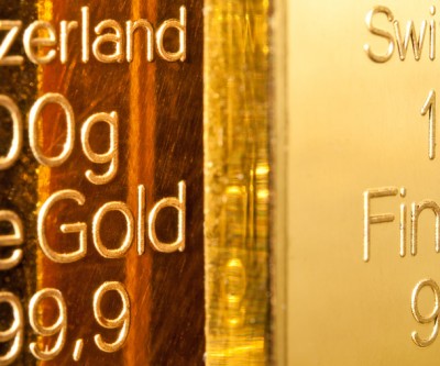
Goldcorp sells mines in Mexico, Guatemala for about $470 million As part of the world's third largest gold producer by market value's ongoing efforts to focus on highly profitable, core assets. Cecilia Jamasmie | January 12, 2017 | 7:09 am
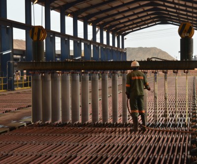
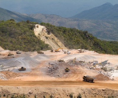
Southern Copper’s $1.2bn Peru mine expansion ready by year-end The new section of the Toquepala open-pit mine in southern Tacna, Peru, is expected to begin operations in early 2018. Cecilia Jamasmie | January 12, 2017 | 4:05 am
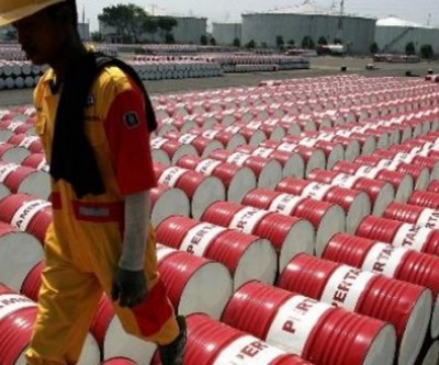
Oil prices running out of reasons to rally For the better part of two months, optimism surrounding the OPEC deal has buoyed oil prices, but bullish sentiment from speculators are showing early signs of abating, raising the possibility that the oil rally is running out of steam. Oilprice.com | January 12, 2017 | 3:12 am
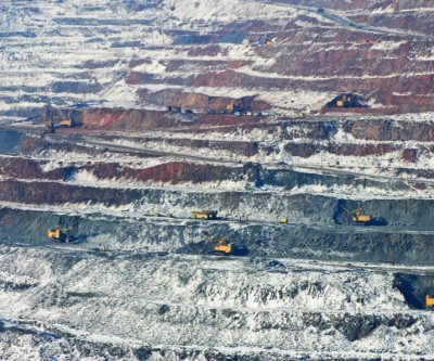
Private capital rotating into mining and metals Private capital funds raised $2.1 billion for mining and metals investment in 2016 – this year 13 funds are targeting $10 billion says new study. Frik Els | January 11, 2017 | 4:34 pm