INFOGRAPHIC: If the periodic table was drawn according to an element’s relative abundance
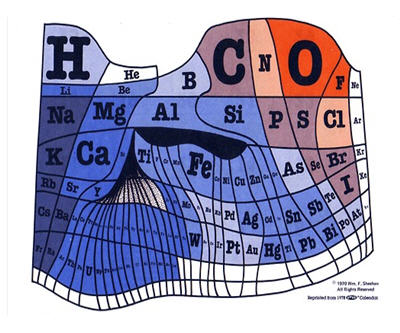
Feminerds – Talzir published this 1970s cartograph, a periodic table where the author tried to roughly size the element’s space on the chart according to its abundance on the earth’s surface.
The colours represent relative electro-negativity.
Go to Feminerds – Talzir’s Tumblr blog to see the chart in its full-sized glory>>

{{ commodity.name }}
{{ post.title }}
{{ post.date }}
Comments